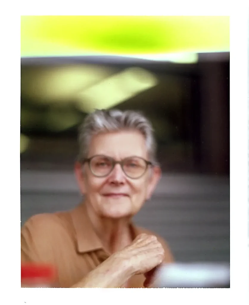
Step into the quiet, thoughtful world of Rebecca Chamlee, a letterpress printer and book artist who turns stories, science, and nature into beautiful handmade books. Rebecca first fell in love with printing in college when she set her name in tiny metal type and pulled a print from an antique press. That single moment sparked a lifelong passion. Today, her work blends careful craft, curiosity about the natural world, and the joy of discovery found on daily walks through the landscape near her home.
What first drew you to letterpress printing and bookmaking?
While studying graphic design at Otis/Parsons in Los Angeles in the early ‘80s, I was introduced to letterpress printing and book binding. In Laurel Beckman’s “Graphic Production Procedures” class, I set my name in metal type and printed it on the antique Vandercook 219.
The excitement and wonder I felt at that moment forever changed the course of my studies and future artistic practice. I enrolled in “Small Edition Books” class with instructors and mentors, book binder Bruce Schnabel (aka Simon Toparovsky) and legendary book artist Susan King, for four semesters.
Susan King’s letterpress printed, beautifully made books were often memoirs about travel, family, and personal experience. The subject matter and aesthetic of Susan’s books were a fundamental influence on my early practice, inspiring me to purchase a Vandercook press to continue printing and making artist’s books after graduation, under the imprint of Pie in the Sky Press.
As an Amazon Associate I earn from qualifying purchases. Read more about our affiliate linking policy.
I was deeply influenced by Susan King. My early work emulated her work with personal stories drawn from my experience, strong graphic design, good printing, and craft. I aspire to that level to this day.
Bruce Schnabel was a talented fine binder who instilled in me a strong commitment to careful craft and skill. Studying with him was a rigorous start to my life as a book artist. I have taken many book binding workshops over the years with some of the best; Monique Lattier, Karen Hamner, Chela Metzger, Ben Elbel, and others. Each one of these fabulous teachers has added depth to my practice and teaching.
Do you remember the first piece you ever made that felt like your voice?
I loved so many of the pieces I made as a student and in my early career when I was exploring the possibilities of making art in the book form.
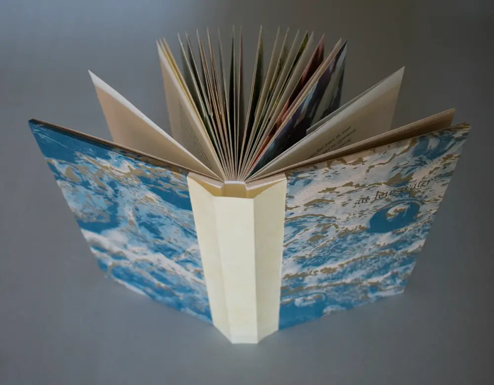
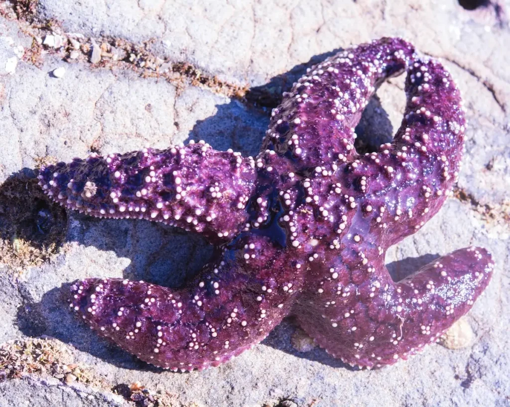
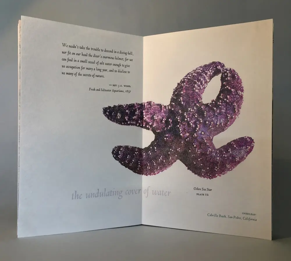
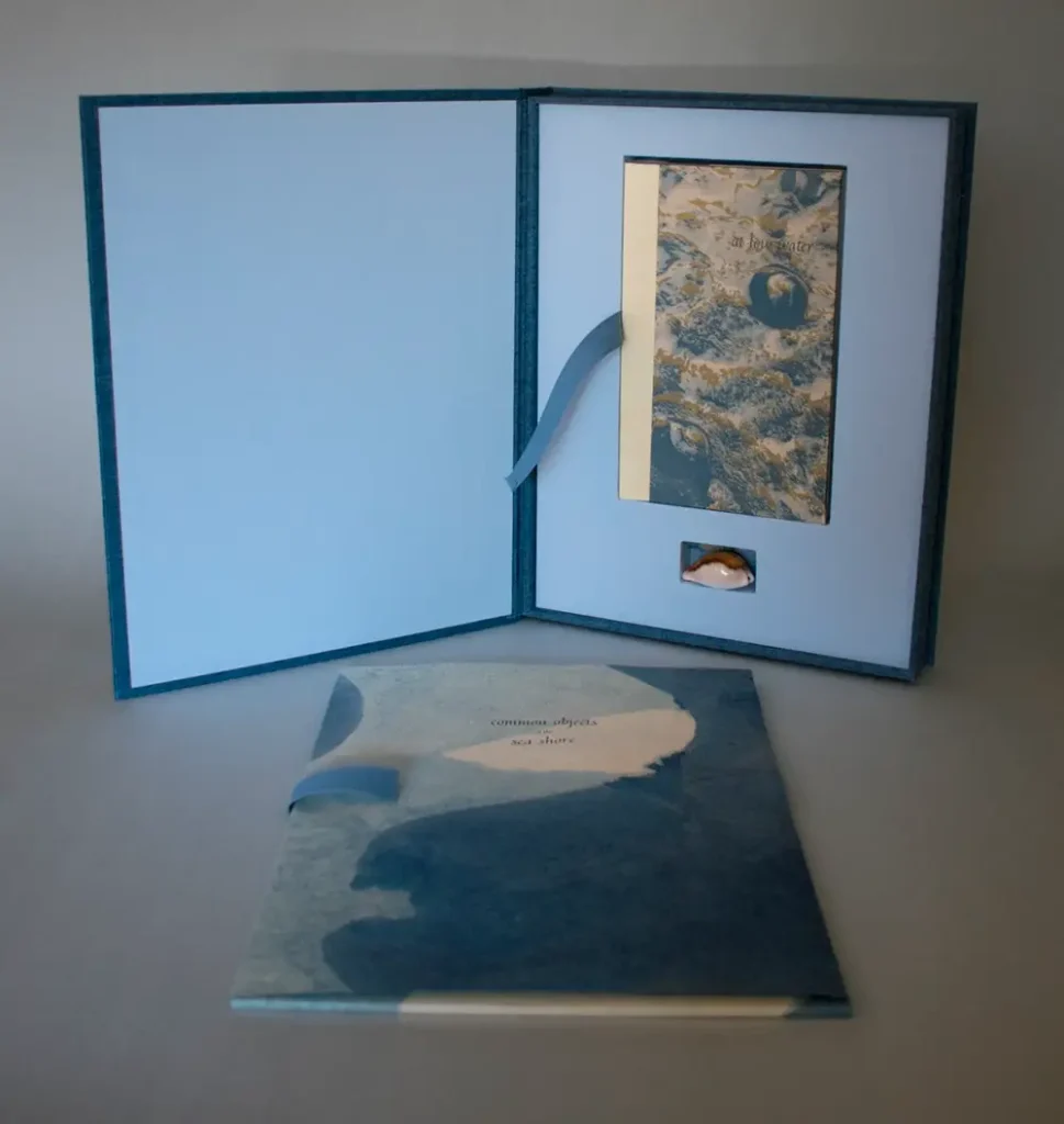
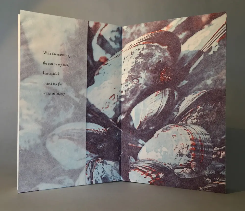
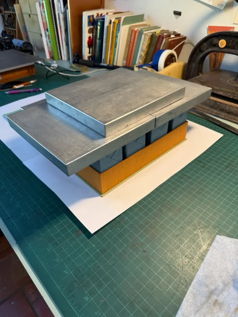
The book that is my favourite and truest to my experience is At Low Water, 2017. It looks back to the beginnings of my passion for exploration and observation of native species to a time when I collected sea animals gathered at low tide to bring home to live in an saltwater aquarium in my girlhood bedroom.
Part memoir, poem, and field study, the layered narrative is told in the voices of the child, the adult looking back, and the present day naturalist. It takes me back to a precious period of my childhood. The binding is a drum leaf/sewn board structure with delicate Japanese paper inserts glued into the fore edge. I adored the square-less cover and its gloved spine that moves off the book in a beautiful, supple action during opening and reading.
Work in progress photos for At Low Water:
Was there a moment when you knew making art was something you would do for life?
It was in that moment in the printshop at Otis when I set metal type, locked up the press and printed my name. I was struck with the realisation that this process would make it possible to combine all the different ways of making creative work that I was interested in: writing, design, typography, image making and paper craft, and in multiples.
Why the name Pie in the Sky Press? Is there a story behind it?
My father’s side of the family have roots in the Upper South; my great-great grandparents were homesteaders in Tennessee. My paternal grandfather, my uncles and dad carried on the tradition of gathering for “Music Nights,” to play traditional roots music on guitar and banjo. A particular song they used to play especially captured my imagination. “The Preacher and the Slave,” written by Joe Hill in 1911 had the refrain, “You get pie in the sky when you die.”
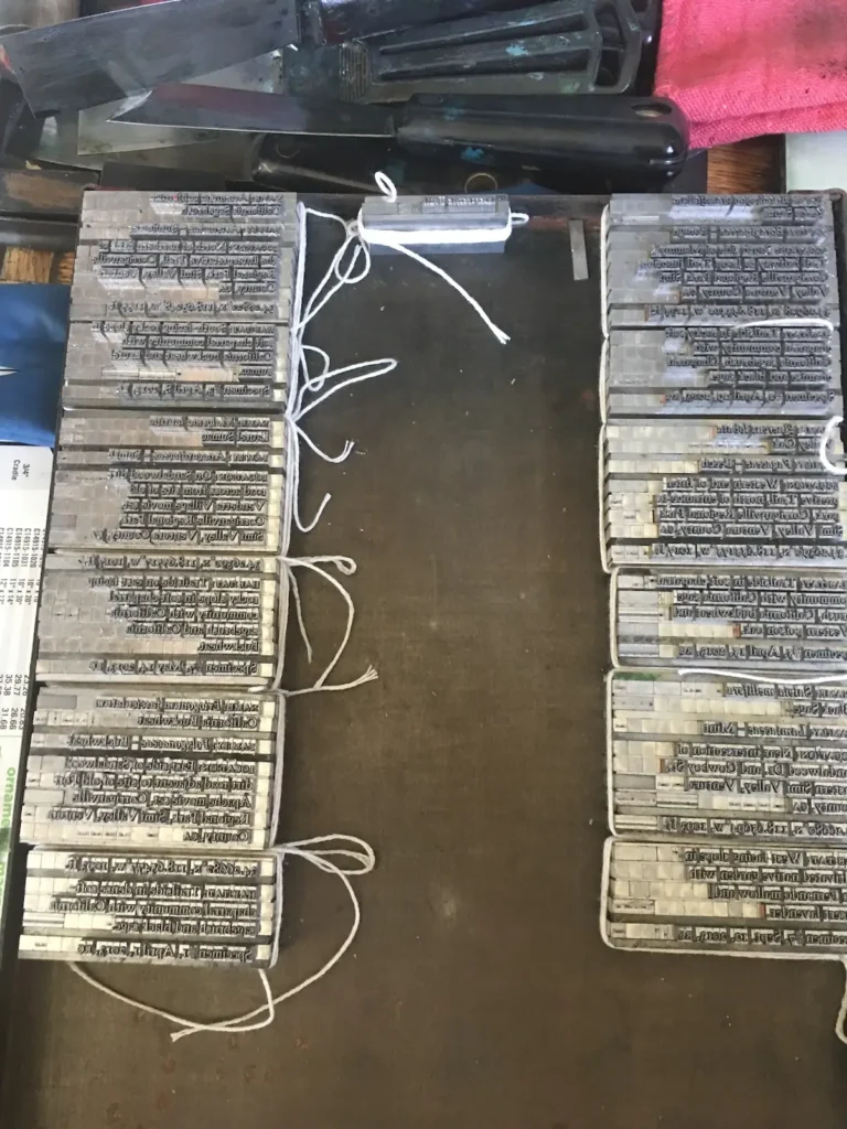
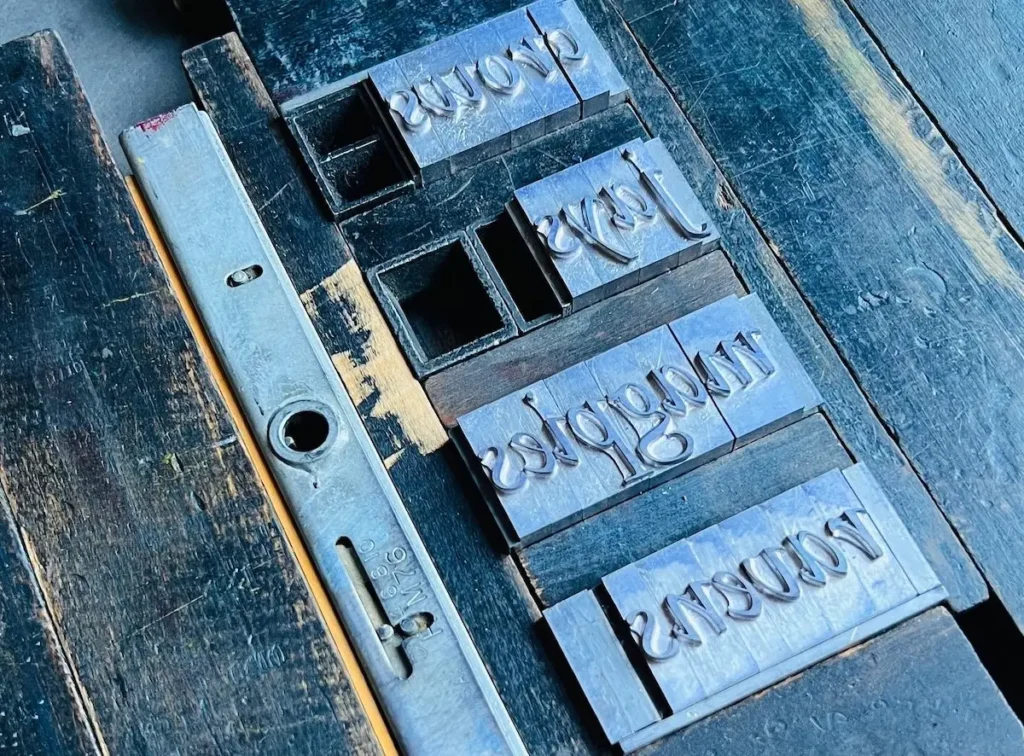
Part of my education as an aspiring letterpress printer was learning the lexicon. Like most fields, printing has its own words and phrases that identify particular tools and processes, some dating back to the 15th century. One of my favourite terms is “pie.“ Pied type is a disarranged mass of type, often caused by dropping a galley, improperly locking up a form, or pulling a type case out too far, causing a disastrous spill of tiny metal letters.
As I pondered the name for my future small private press, I decided to combine letterpress terminology with the memory of the music that formed the backdrop of my childhood, hence the name “Pie in The Sky Press.”
How do landscapes or ecosystems shape your creative ideas?
I spend every morning walking my dogs on the trails in a wildland park near my home. As I move though the park on the rugged paths among chaparral and sandstone or in the oak woodland by the creek, it’s like a moving meditation. And often, the most creative time of my day.
I am so familiar with this landscape after witnessing it for over 30 years, but I still notice new details all the time. Discovery leads to curiosity and the desire to know the secrets of this beautiful place.
Then I ask myself, if I were to learn the intricate details of the survival of native plants in this complex environment prone to drought and wild fire, could I use that knowledge to tell my own story about experiencing this landscape?
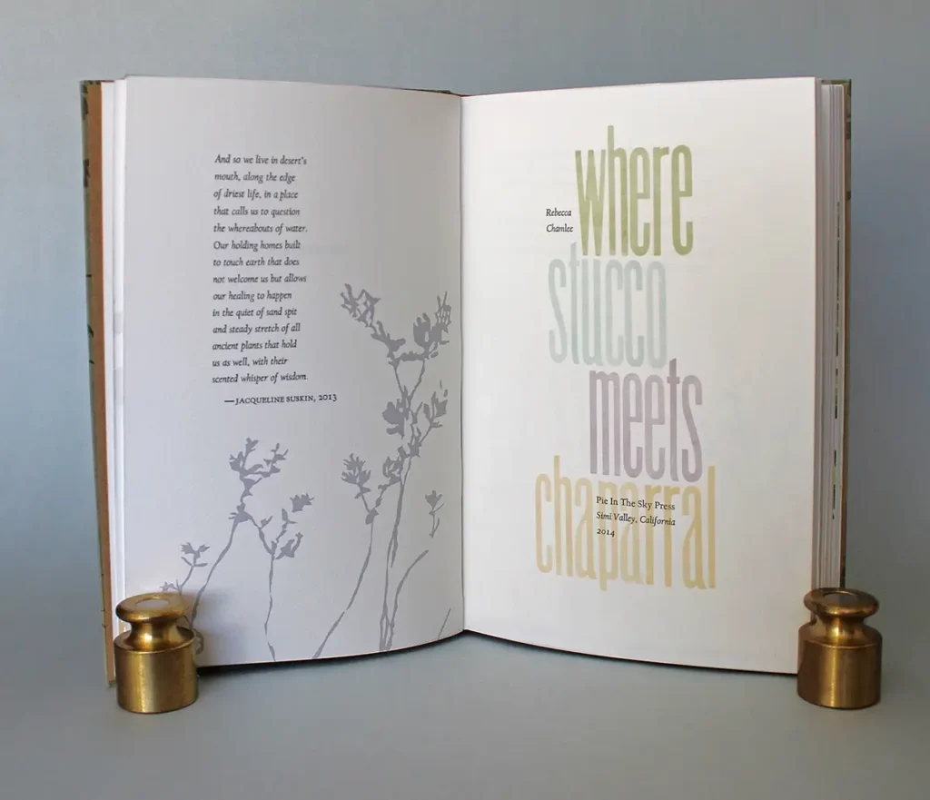
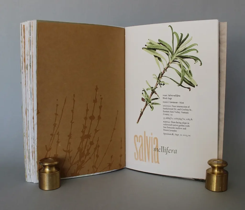
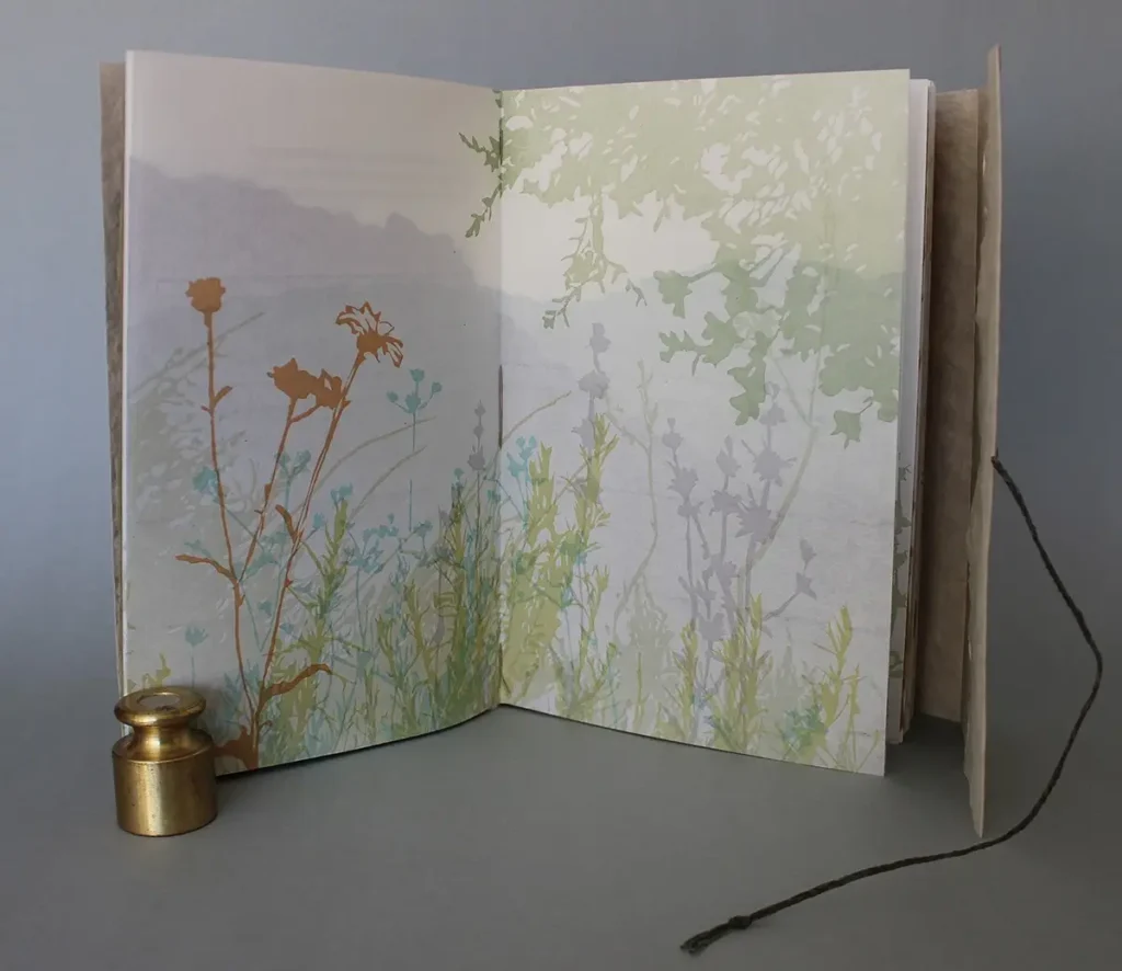
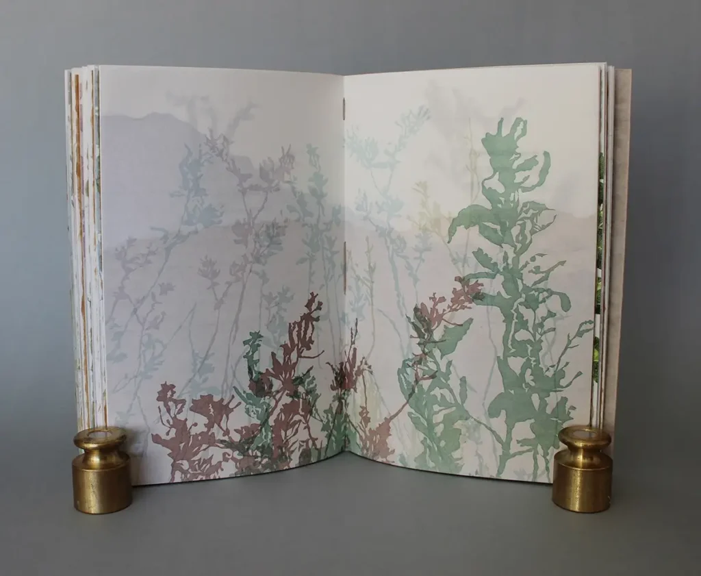
This inquiry led to the first project that just focused on my relationship with the natural world. Where Stucco meets Chaparral examines the native flora found on the trails though the sandstone formations, chaparral and oak woodlands that surround my home and my personal connection to the landscape.
Where Stucco meets Chaparral examines seven indigenous plants through botanical data, personal knowledge, natural history and observations acquired during the many years of daily walking meditation on my cherished trails. Detailed images of the plant specimens printed in multiple colors in tight registration through their seasonal life cycles accompany more impressionist representations of the environmental context where they prevail.
Excerpt:
I am a casual naturalist. I study the native plants along the trails through sandstone formations, soft chaparral and oak woodlands near my home in an arid inland valley of southern California.
My neighbourhood was built on the fringe of a settled area, where stucco and cul-de-sacs meet chaparral. As the lucky beneficiary of urban sprawl, I love this beautiful land, surrounded by open space.
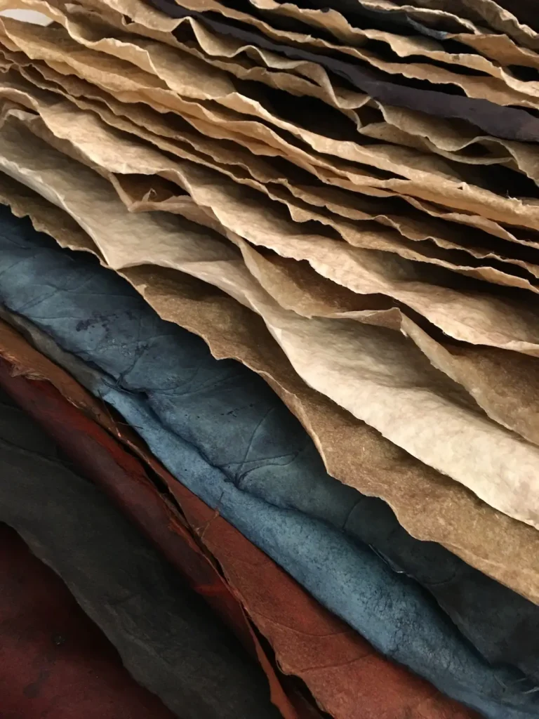
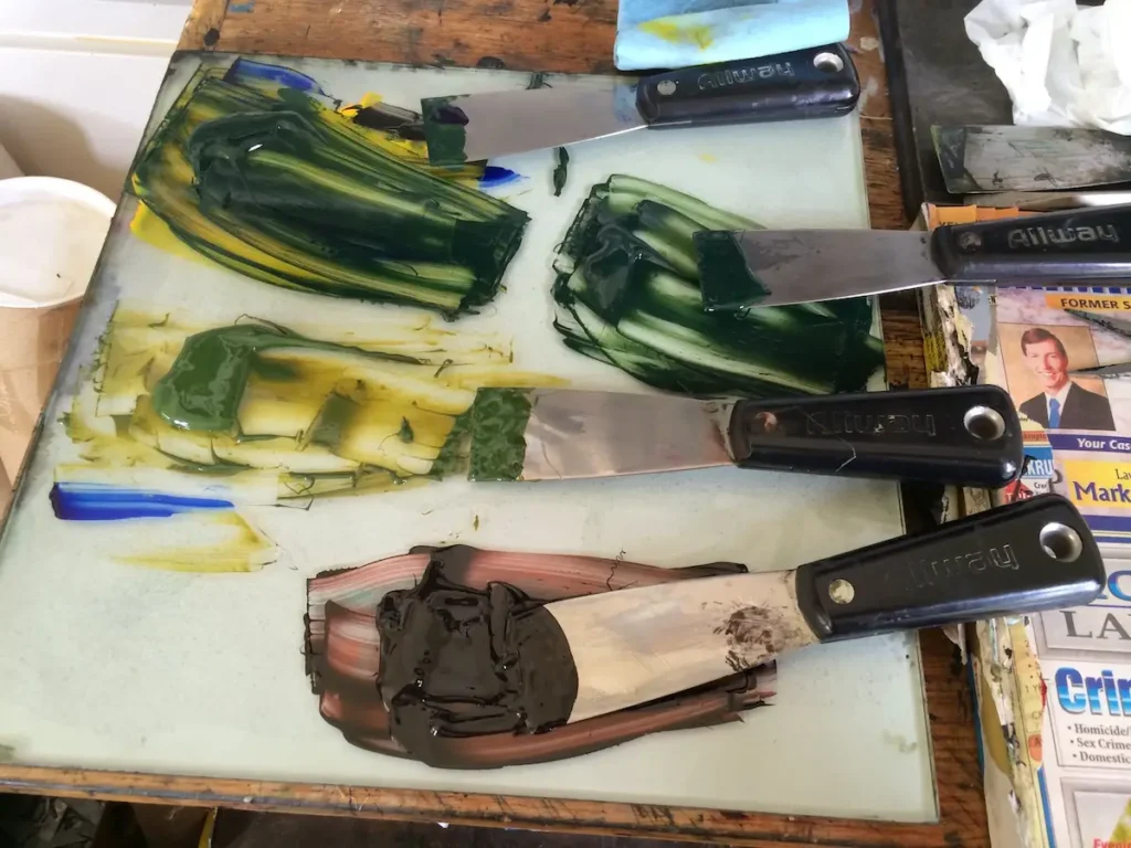
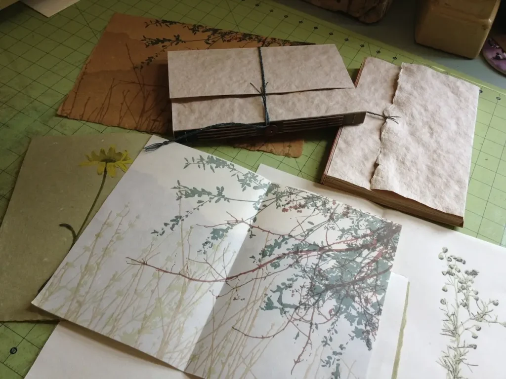
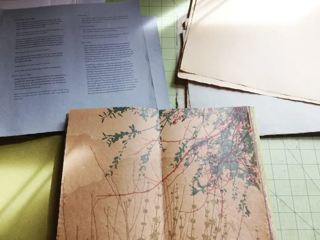
In process photos of Where Stucco Meets Chaparral:


Is there one thing about the natural world that always pulls you back into the studio?
Curiosity.
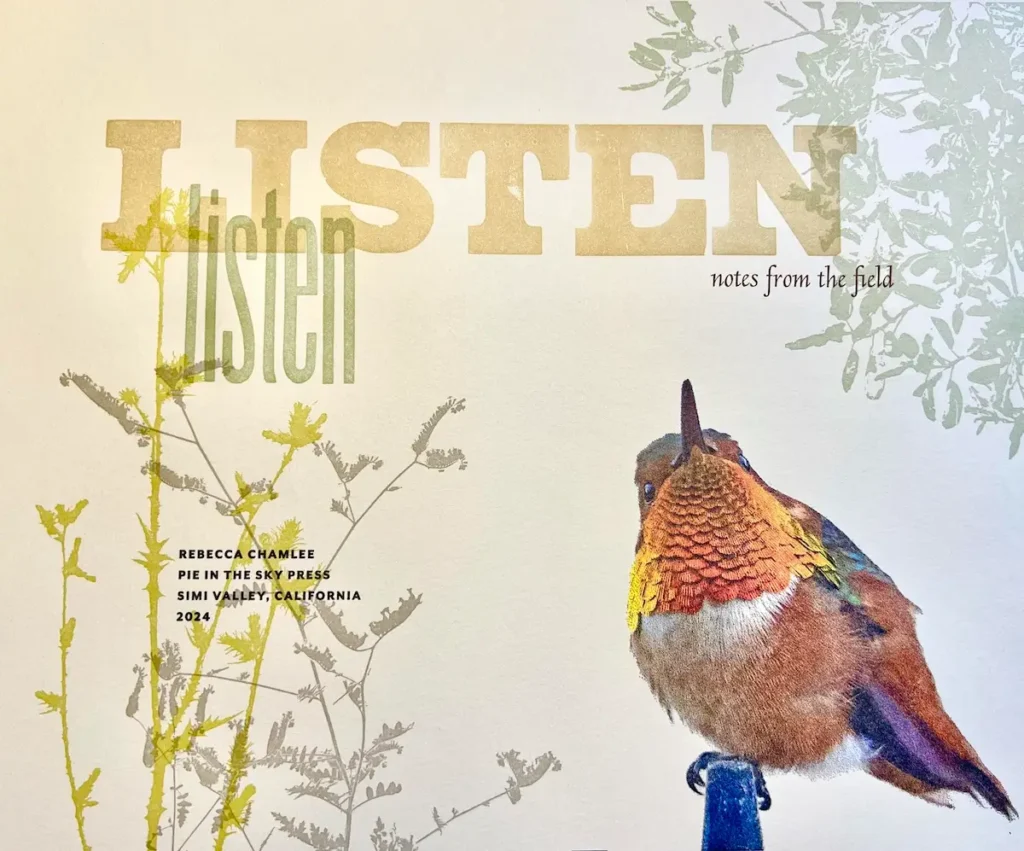
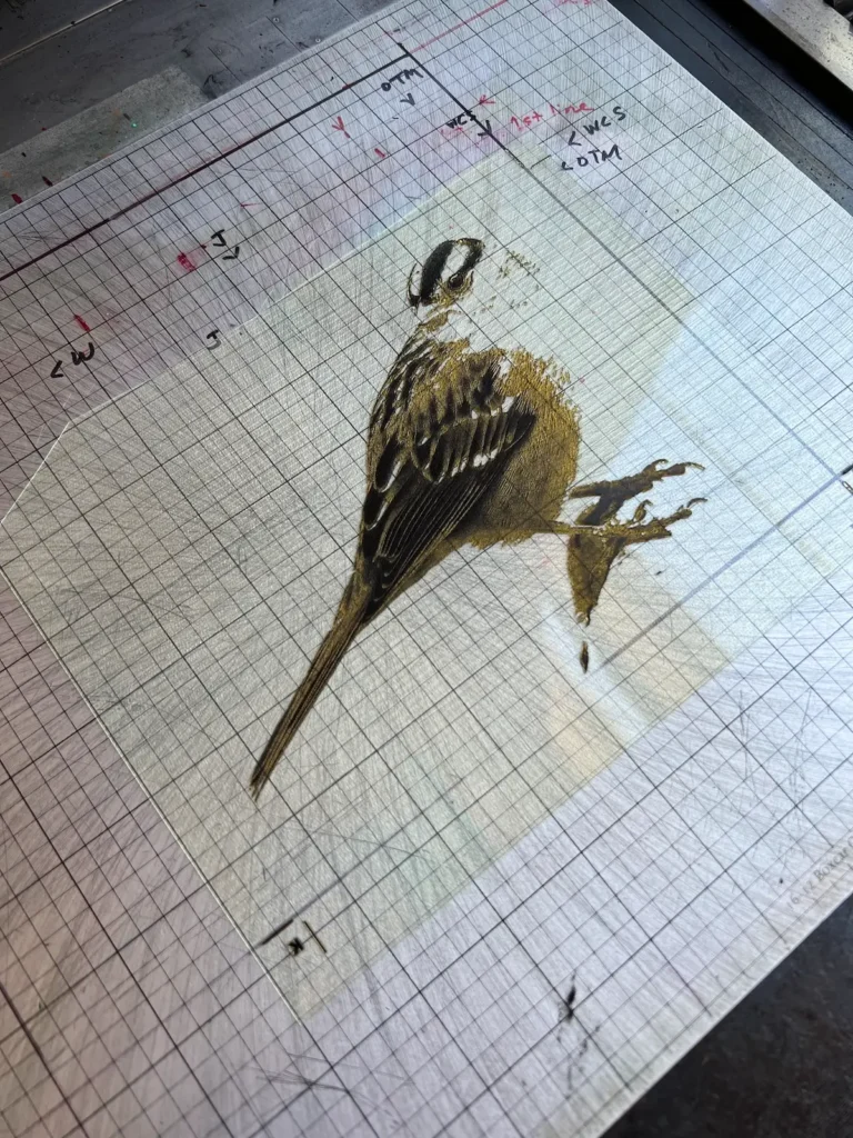
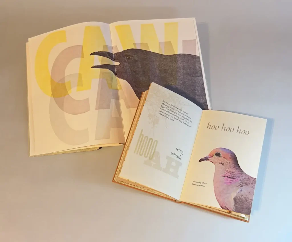
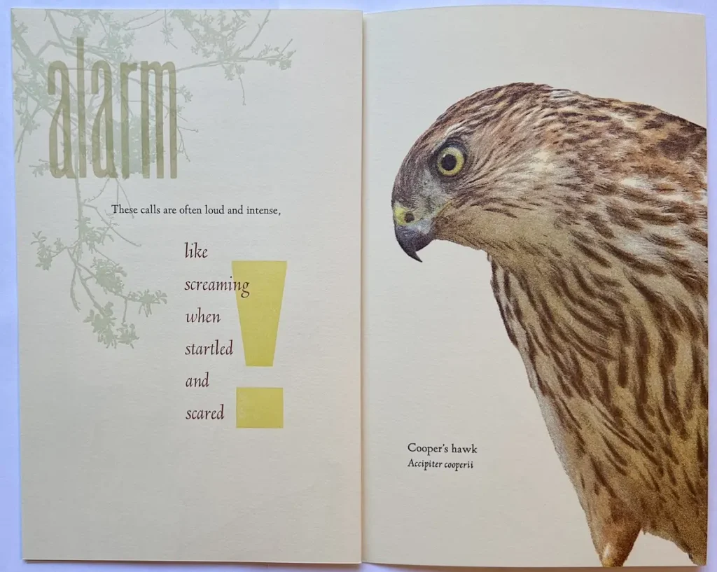
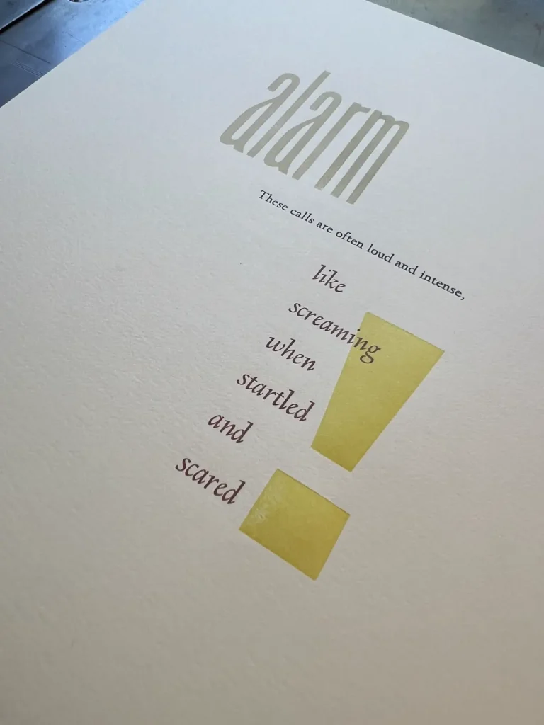
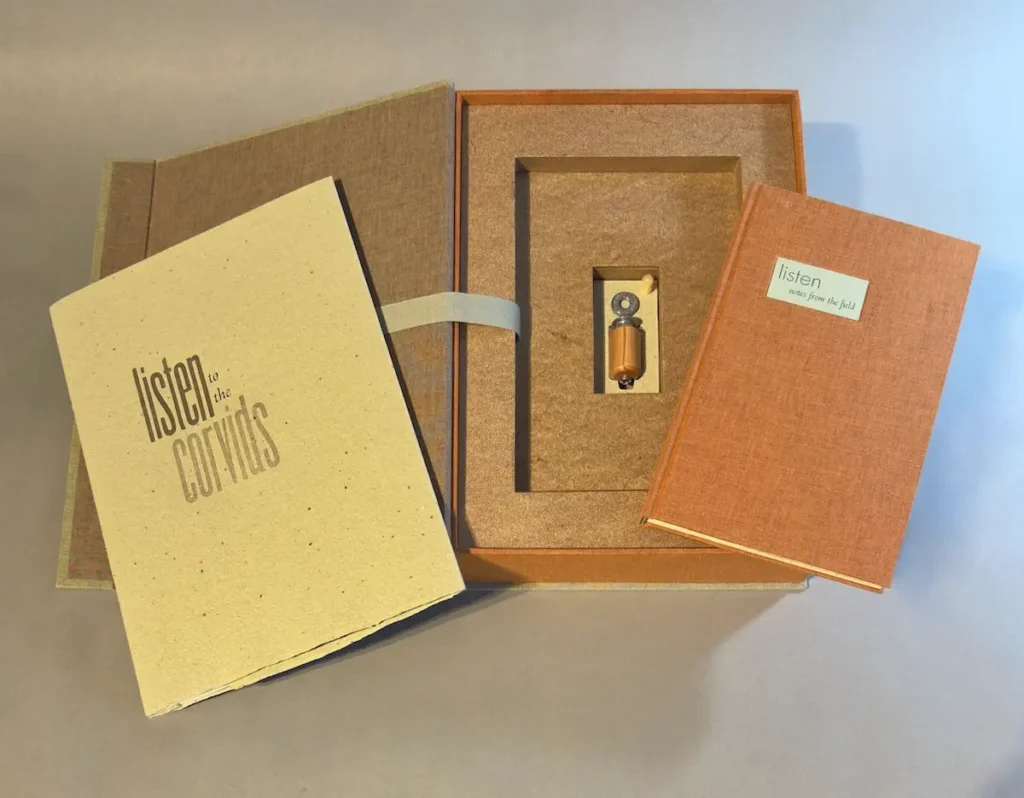
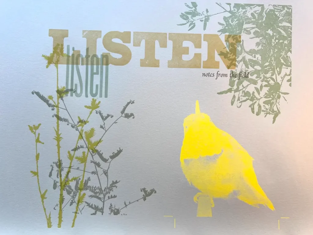
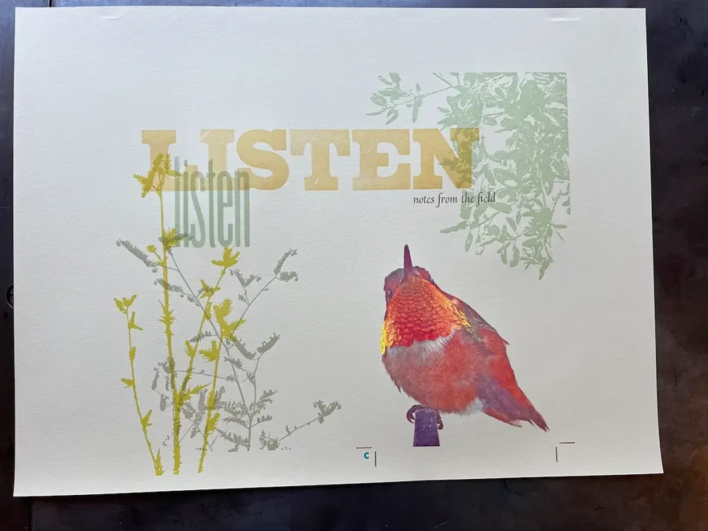
In my most recent book project, Listen, notes from the field, I became aware of the sounds of birds. I began to wonder what the vocalisations meant and how they differed from bird to bird.
I sought the answers to these questions through research. Along the way, I found a book, “What the Robin Knows: How Birds Reveal the Secrets of the Natural World” by Jon Young. He recommends utilising a “sit spot” routine to allow the natural world to unfold before you. This practice allowed me to witness nature in a way I’d never experienced in the years of exploring trails on foot. In a comfortable spot in nature, I sat, slowed down, and observed to discover the wonder in the moment.
If I stopped and settled in one place for a while, I was able to open up to the more subtle vocalisations around me. More than simply identifying birdsong I began to notice the intricate ways birds communicate with each other.
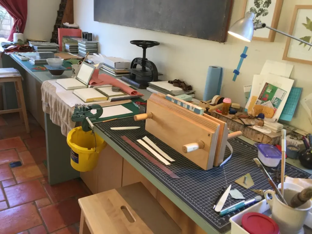
Describe your creative space.
My print shop/bindery/studio is set up in the living room of our suburban home. It’s a big, bright room that previously was rarely used.
On Mother’s Day in 2010, my husband and son surprised me by moving my printing press from the garage into the house. This provided a lot more space for work surfaces, storage, and equipment; not to mention a much better, cleaner space to work.
In 2011, I was awarded a generous Investing in Artists grant in the Artistic Equipment and Tools category for the purchase of book binding equipment by The Center for Cultural Innovation (CCI). They considered 374 applications from artists across California, and my application rose to the top based on an extremely rigorous and competitive review.
My husband designed two large custom work benches with storage that my brother-in-law built in his cabinet shop.
In 2016, I replaced my original Vandercook 4 that I bought when I graduated from art school with a Vandercook Universal III press.
I am so fortunate and grateful that I have everything in my studio that I need to make my work.
What’s essential in your printing studio — tools, presses, papers that you can’t live without?
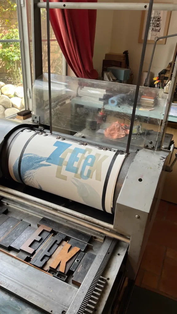
The heart and soul of the studio is the printing press. My 1968 Vandercook Universal III has an adjustable bed, variable-speed power carriage, and a tower for registration tapes. It can print sheets up to 18” x 24”. My husband (sometimes referred to as the maintenance department) spent considerable time restoring it. The press runs perfectly.
With the CCI grant, I purchased a Jaques board shear, a large, hand-operated machine for cutting single sheets of binder’s board or heavy paper. Like scissors, a board shear uses two blades. The stationary blade forms the edge of the cutting table, with the moving blade mounted on a cutting arm. The gauge on the table allows the consistent cutting of materials.
Additionally, the grant supplied the finances for a guillotine, which is used for cleanly cutting stacks of paper. It is a single-knife cutter, in which a heavy blade descends between vertical runners. My unusual request for a guillotine seemed to impress the grant panel.
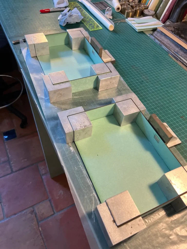
Another essential tool is a Glowforge laser cutter in the upstairs office that has proven indispensable for cutting the many parts of the complex boxes I make to house editions.
Of course, I couldn’t possibly work without all the hand tools I love. I set out early to get the best that I could afford and have built a collection that works for me. I have the perfect knives, folders, measuring tools, brass triangles, glue brushes, lamps, weights, book presses, composing sticks, gauges, and more that make it efficient and pleasurable to work.
How do you choose materials — paper, type, ink — for a project?
I endeavour to let the subject matter of a project lead me to sympathetic material choices.
I adore paper! It forms the foundation that must complement every element on the page. Inspiration from the natural world is key along with understanding the physical characteristics of the sheet. I always pick a smooth off-white paper for pages where four colour images and small type appear. The images require the perfect substrate for success. I then think about handmade, textured, translucent or coloured paper for expressive type and layered imagery. Most of my books contain multiple kinds of papers, each adding depth to the overall concept.
I believe that successful typography should reinforce the meaning of the text. The visual form of the letters can evoke emotions and context beyond the literal definition of the words. Playing with type is a major part of the development of the look of the project.
Inspiration for colour is found in the subject matter of the project. In a project about the wild birds that come to my yard, the colour choices were driven by feathers and the sky. In Where Stucco meets Chaparral, a book about native plants, colour was pulled directly from the landscape. The colour found in At Low Water about tide pools, was inspired by seaside rocky pools and the animals and plants that live there.
How do you balance precision (like letterpress) with spontaneity?
Truth be told, spontaneity only happens in the exploration part of the project. As I work, I am led by the question, “What if?” Being free to see how one thing can lead to another adds vitality and energy to the process.
Is there a part of the process you look forward to the most?
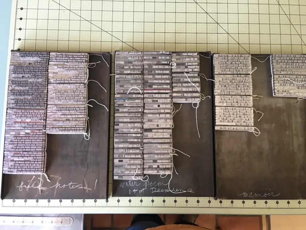
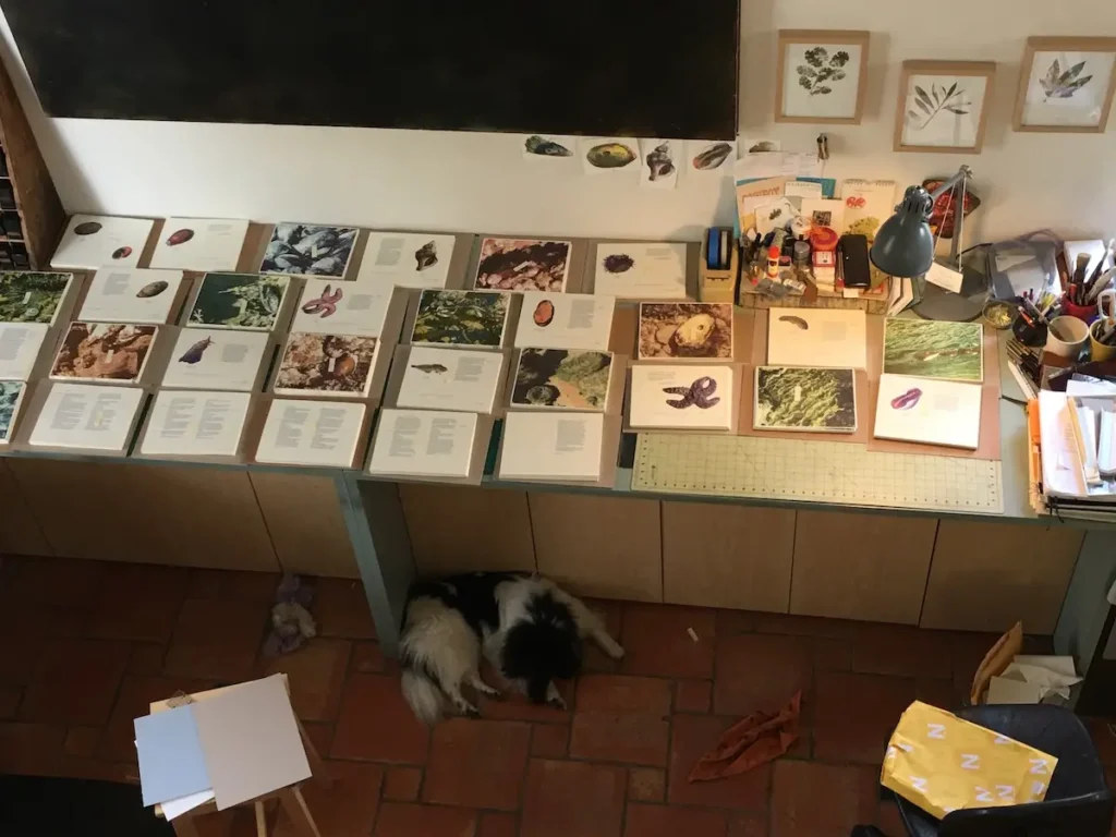
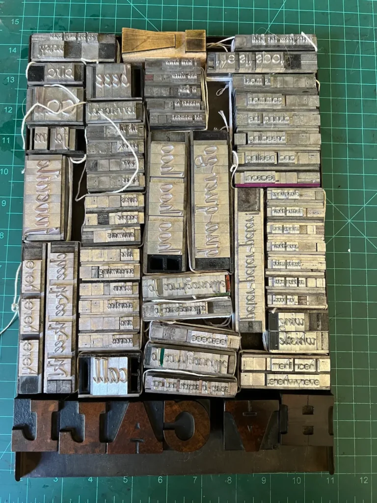
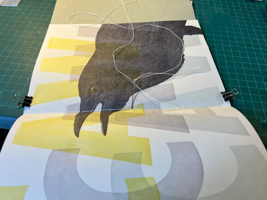
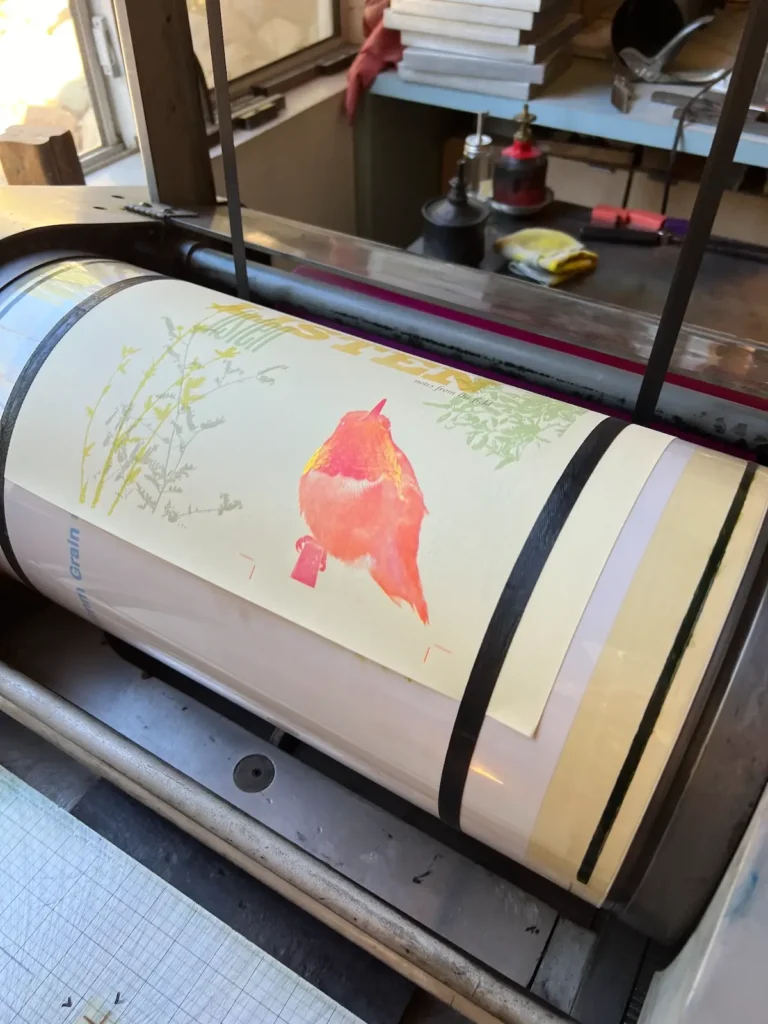
My most recent project, Listen, took the longest of any of my books to print. During an eight month period in 2024 and 2025, I printed. It was a daily routine of mixing ink, setting up the form, running paper through the press, maintaining consistency, taking care—that became the most joyous and rewarding period of making I’ve ever experienced.
The printing is when all the months, and sometimes years, of thought and planning come together. What began as simply an notion in my head finally comes to life and then can exist on its own in the world.
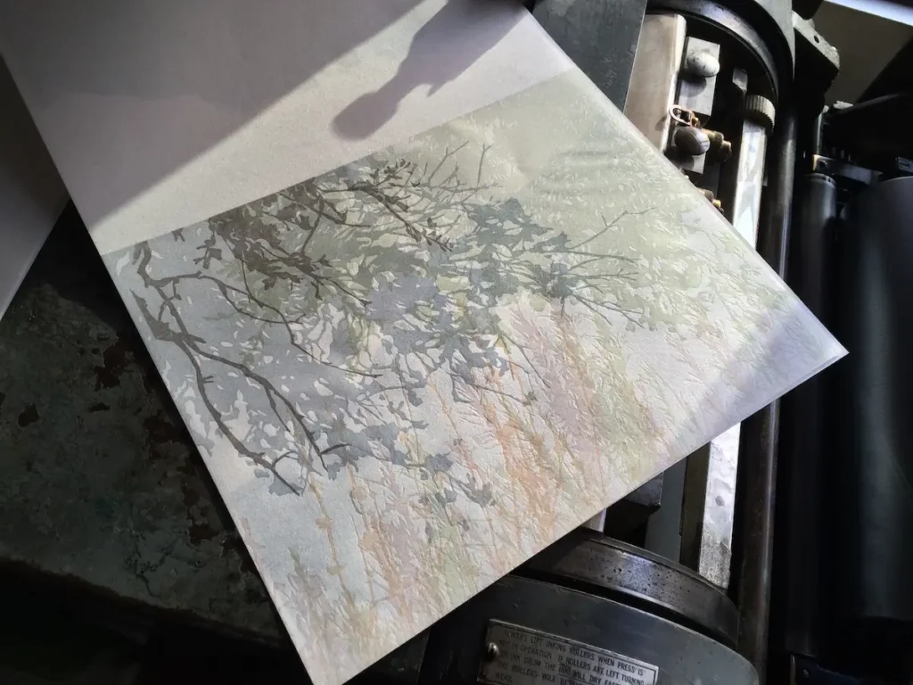
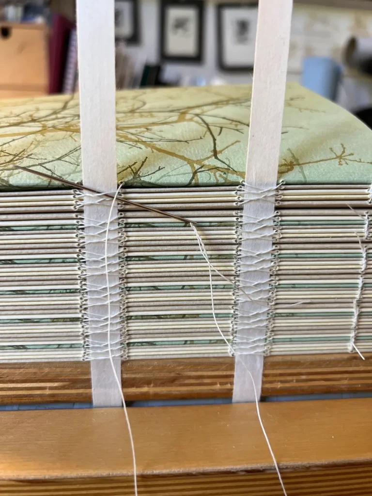
Work in progress on Listen notes from the field:
What’s something you used to fear trying in your work but are glad you did?
My father was a hobby photographer and encouraged me as a teenager to pursue using a camera to express myself creatively. He bought my first camera, a Rolleiflex twin-lens reflex camera, for my 16th birthday and set up a darkroom in the basement.
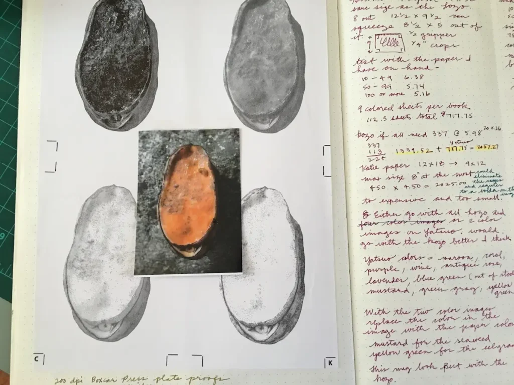
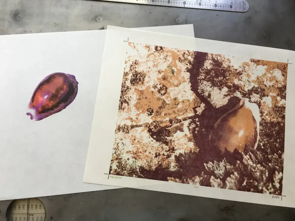
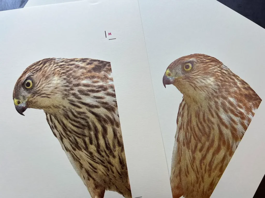
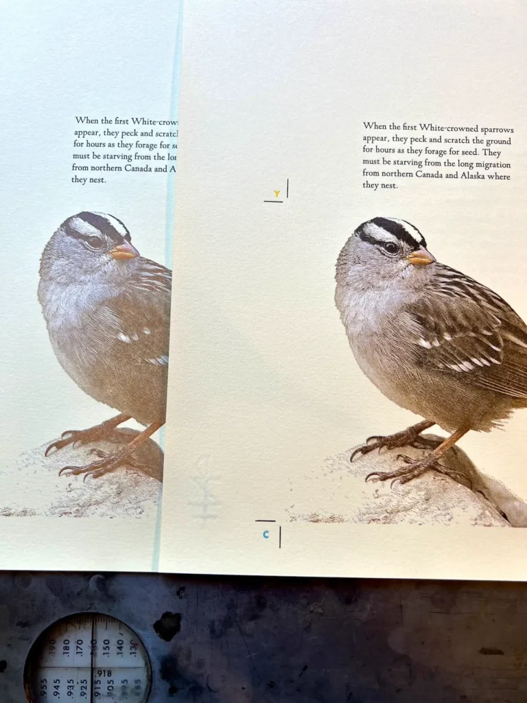
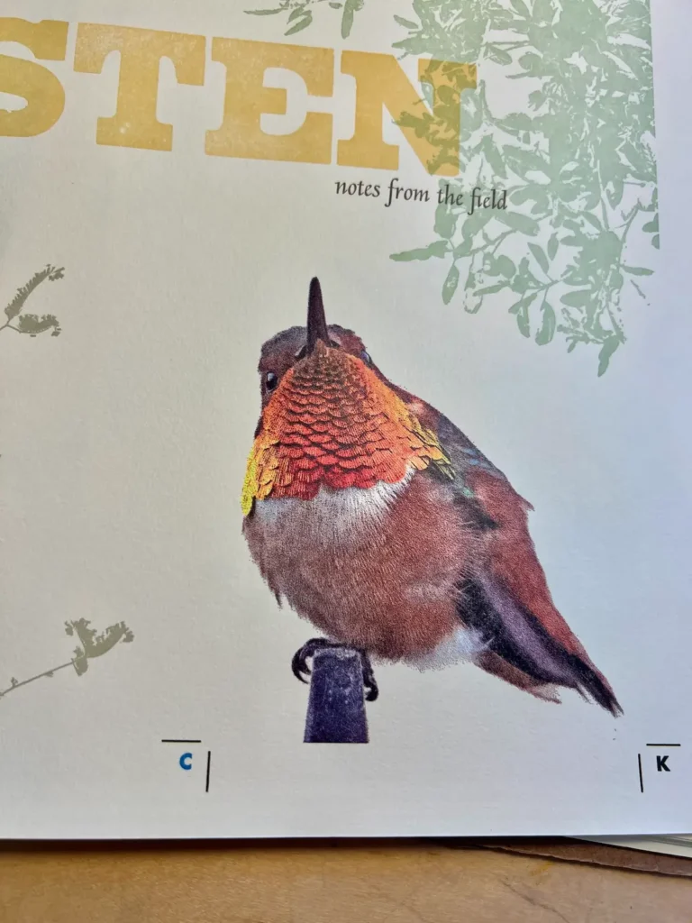
When I became a letterpress printer, my heart’s desire was to print my photographs. Continuous-tone photographic images are characterised by gradual transitions between shades and colours and have frustrated letterpress printers for decades. The need for the traditional halftone screen often produces coarse prints, difficult registration, and colour issues.
My early experiments to unlock the secret of letterpress printing photographs with mounted magnesium engravings and metal-backed photopolymer plates were utter failures. With the technology of the time, my prints were muddy, impossible to register, and completely unacceptable. I admitted defeat and forgot about it for over a decade.
Then in 2009, I attended the first College Book Arts Association conference at the Iowa Center for the Book. I went to a talk/demo by Dan Mayer of Arizona State University called “Low-end/High-octane Photopolymer Platemaking Demo.” Dan produces inter-disciplinary, limited-edition books that are unique and experimental. In the demo, he described using a stochastic or random dot to make printing plates of continuous tone imagery instead of the traditional half-tone rosette dot.
This new approach, combined with a new plastic-backed polymer plate material, set me off on an extensive quest exploring the possibilities of letterpress as a means for producing successful continuous tone prints. This experimentation led to the development of a process that achieves detail, realism, and sensitivity to the source material.
For over 15 years, I have continued to perfect the process that has become central to the work I make today. Photographic specimen images have appeared in my books since “My Partial Tongue” was published in 2011, gradually improving in fidelity and richness.
Challenging and technical, the four-colour specimen images that are an integral part of the work to follow have added precise detail and accuracy that are at once art and science.
How do you decide when a piece or book is finished?
There are several points in a project when I have to decide if it’s finished. Does the writing say everything I want to express, honestly and understandably? Is the flow and design of the book well organised? Do the images support the narrative?
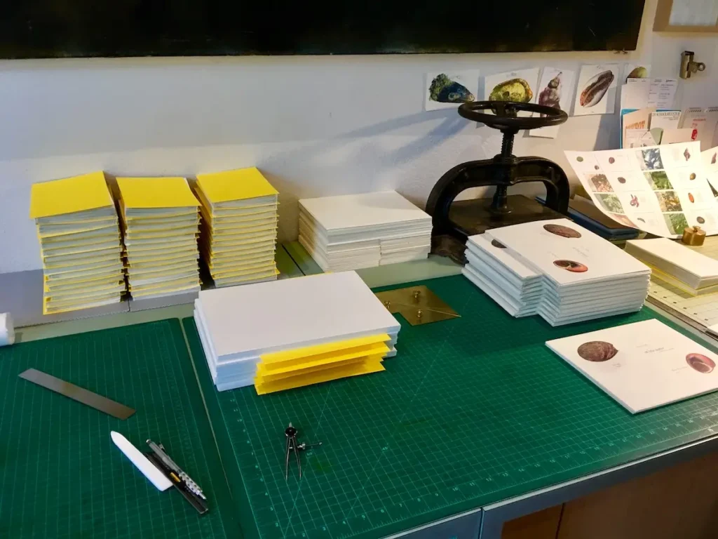
When every page and element is finally printed is a big moment of the completeness of the project. Then begins the binding and box making. Only when the final label is glued to the final cover of the final edition is the book truly done.
In what ways has your art changed since the early years?
Original stories from my childhood and personal experience were the subject matter for the majority of my early work. It spoke to the notion of memory; family stories passed down through the generations that become personal folklore, a unique way of presenting a family archive.
Since that time, the work has become more complex—both structurally and conceptually—with multiple layers of narrative and imagery.
The fine press editions of poetry that I produced from 2009 to 2012 offered a departure from the early work. These projects were the opportunity for a high level of craft in execution, plus collaboration and interpretation that was both exciting and challenging.
Since 2012, my artist’s books have examined the intersection of my artistic and scientific interests by collecting and cataloging the natural world. As a life-long amateur naturalist, I have studied the rich and diverse elements of the natural world that my native California has to offer. From the unique flora and fauna of the arid inland valley that I call home to the rocky tidepools of my childhood, I am inspired to record, interpret, and celebrate nature.
How do you balance thinking, designing, printing, and binding?
My projects are typically a two to three-year exploration of process. Allowing myself this lavish space of time gives me the opportunity for lengthy reflection about my chosen subject. I begin with research and free writing exercises to start to develop the concept and direction of the work.
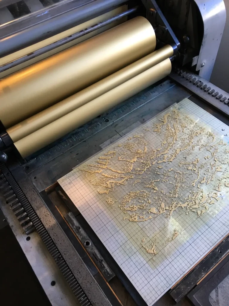
As ideas for imagery emerge, I conduct months of print testing to discover what the printing approach will be. Simultaneously, I work on the design and structure while polishing the writing. Every step of the process is documented in journals.
Only when all the elements are figured out, can the making—printing and binding— begin.
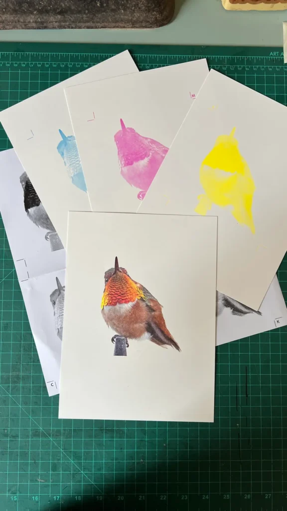
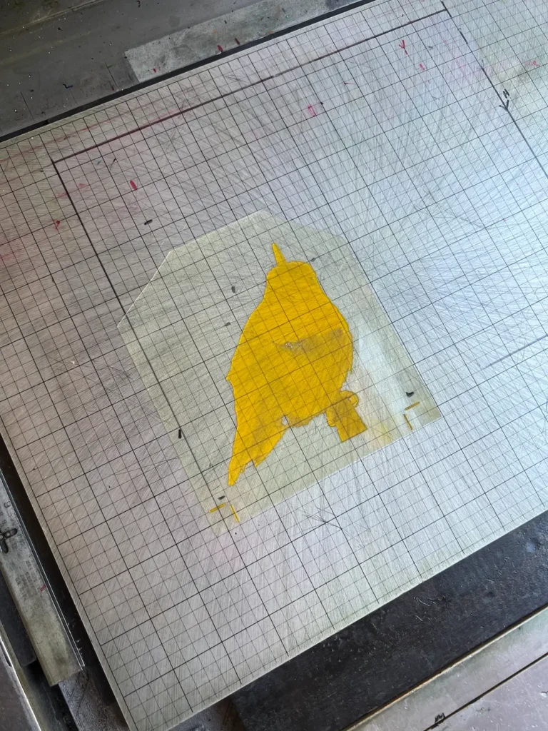
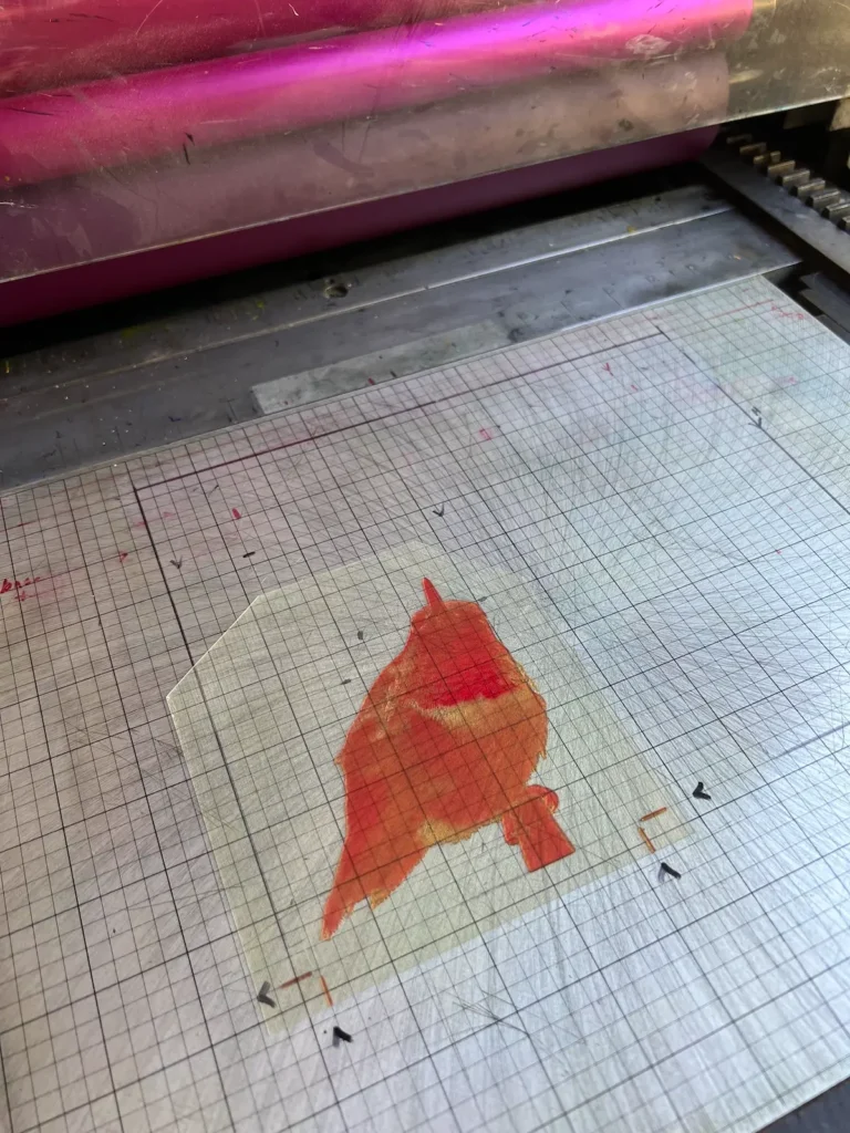
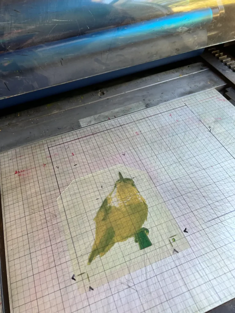
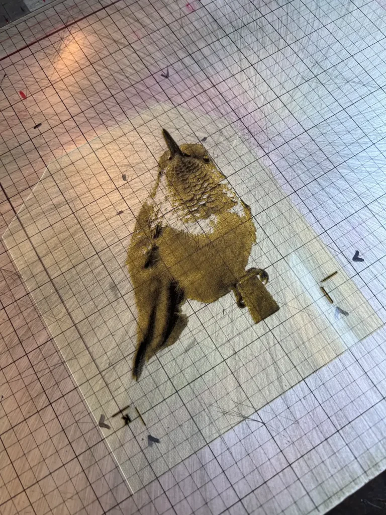
Print testing Hummer for Listen notes from the field:
What advice would you give your younger maker self?
Hang on and be prepared for a future beyond your wildest dreams!
Where can people see your work?
I maintain an up-to-date website, at https://pieintheskypress.com/.
My work is in prominent special and private collections such as Yale University, The Getty Research Institute, Stanford University, University of California, Berkeley, UCLA; and Bainbridge Island Museum of Art, to name but a few. Institutional libraries offer access to the materials in their special collections so they can be seen and studied by request in designated reading rooms.
My website has a complete list of the institutions that hold my work. Folks interested in seeing the books in person can hopefully find a collection near them.
Rapid-Fire Fun:
Morning prints or late-night bindings? I’m definitely a morning person; I never ever work at night!
Hands dirty or scissors first? Dirty hands for sure.
Favorite letterpress word to use? It has to be printer’s devil, historically a young boy who helps out in the print shop. If anything goes wrong, you can always blame the devil.
One thing on your desk right now? A color wheel.
Interview posted April 2026
Browse through more inspiring interviews on Create Whimsy.